I recently went to the Brand New Conference, a one-day gathering of designers to discuss branding, identity and ideation. The list of speakers included designers from notable design studios and ad agencies from all over the world, including Australia, Peru, Canada and the United States. As we expand our branding offerings at Chapter Three, these issues are increasingly relevant, so I’d like to share some of the more interesting bits from the day.
The common thread throughout all of the talks was the notion that branding is about telling a story. Stories help an audience to engage with the content and relate to the brand’s personality, rather than the brand shouting at them with a wall of information.
As presenters discussed case studies of their work and revealed secrets of their process, many chose to work with a simple mark and take advantage of collateral and context to create the personality surrounding a brand. Vince Frost, of Frost Design, uses clever wordplay and simple typography to create a foundation and allows other brand components to play off of that.
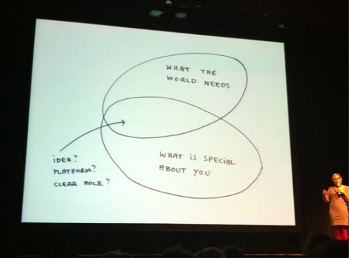
Marina Willard, of Wolff Olins, believes that brands are a promise, and emphasized playfulness and participation with the audience. In a creative process, ideas are the intersection of “what the world needs” and “what is special about you”. She emphasized the value of the individual designer, saying that without bringing something unique to problem solving, everyone’s solutions would look identical and be uninteresting.

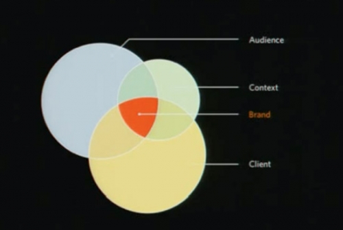
Christopher Simmons, of Mine, spent his time discussing one case study in depth, including all of his process. Like Willard’s diagram, Simmons believes that a brand position is “focused where the concerns of the target audiences intersect with the concerns of the client and context.”

He showed work for Bun Mee, a local Vietnamese sandwich shop, which included logo, menu, website, interior design and storefront. Much of the work, like interior design and handcrafting a large wooden menu board, wasn’t in the original scope but was organically absorbed as he engaged with the project. The result is a more cohesive experience in which a small team was able to create a culture for both the flat collateral and physical space. It’s a rare instance when this is possible, and taking on out of scope elements is a dangerous game, but Simmons demonstrated a real success.
Everything presented at the conference made it clear that a traditional approach is often no longer appropriate or effective. Though very little web or interactive work was shown, these are issues that are tangential to the work we do. It’s important to consider how a story can be told with each brand, even in the form of a website.