I just got back from An Event Apart San Francisco and my brain is about to burst. I’ll do my best to summarize my most significant learnings and share lots of great new (to me) tools and resources.
Recurring ideas
We need to look outside of ourselves when designing websites. If you’re reading this, you’re probably one of us; you know and understand the web and you’re probably using an up-to-date device to surf it. But there is an entire planet of people that aren’t us and they’re increasingly using the web from their phones and devices that we thought were long gone.
Major questions
How can we serve up a mobile experience that isn’t inferior to the desktop version (Karen McGrane)? How can we build websites that will still be around in ten years (Jeremy Keith)? How can we work more efficiently using tools like SASS (Chris Coyier)? How can we better promote the health of the web (Ethan Marcotte)?
Mobile is here to stay
If you have any doubt about the prevalence of users on smartphones and tablets, Luke Wroblewski made this chart for you:
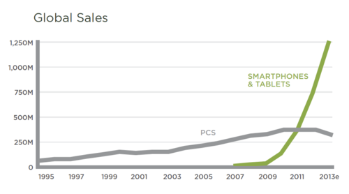
This should scare you (it certainly scares me). Since about 2011 smartphone and tablet sales have dramatically outpaced the sale of PCs, which have already hit their peak. We can no longer dismiss users on mobile devices; the future will be mobile.
And then there's this one:
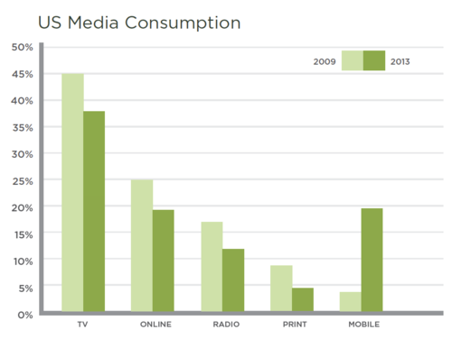
Notice that between 2009 and 2013 only mobile media consumption has increased. TV, online, radio and print have all decreased. Mobile content is increasingly integrating itself into our content consumption habits.
Here are some more mobile statistics in case you need ammunition to convince your boss that mobile is a thing:
- E-commerce from mobile devices was responsible for over 25% of all purchases made on Thanksgiving in 2013
- 78% of monthly Facebook users in the US are on mobile
- 3 hours of video are uploaded EVERY SECOND via YouTube on mobile devices
- Ebay made $13 billion in mobile commerce in 2012
Design for standards, not devices
So, you’re designing for mobile. Cool. Which of the zillions of devices do you decide to base your static design comps on?

This chart shows the physical screen sizes of nearly 3,997 different Android devices. That device count was from August of 2012; the Android Fragmentation Report from July 2013 found 11,868 distinct devices (yikes!).
Alright, here’s one more, showing the amount of variation within the Samsung Galaxy series of devices alone:
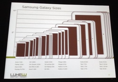
Designers and developers; mass hysteria!
This is the world we live in now and this requires a new web design process. It stings a bit, but to effectively design for all of these devices we can’t just make static comps anymore. We need to learn how to develop prototypes of our designs, or at least collaborate more deeply with developers. Tools like Macaw (coming soon!) aim to bridge the gap between development and design and look to be a great first step.
Look Ma, one hand!
With a traditional desktop computer, it’s the job of the mouse and keyboard designers to create ergonomics. When we design for touch devices, however, we are the ones responsible for creating ergonomics in our mobile designs. We need to consider how users hold their devices and which areas of the screen are more easily tappable. In an observational study, about half of mobile phone users used their phones one-handed.
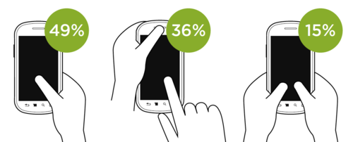
One-handed usage is a great way to test your website. If you can effectively navigate using one hand you’re accounting for the most common mobile usage. Luke Wroblewski urges us to “keep the keyboard away” as much as possible. FourSquare does this by using location data on the phone to suggest nearby business to check in to, instead of requiring the user to type in the name (although that’s still an option). Google Flights lists popular destinations or even provides a map view where you can tap your destination as an alternative to typing it out. These changes improve the ergonomics of our interfaces.
Open Device Labs
So how do you test your websites when there are literally thousands of devices you might need to account for? Jeremy Keith talked about Open Device Labs, physical spaces that host a library of donated devices that are freely available for testing. How many of you have an old phone sitting in a drawer collecting dust? Consider donating it to an ODL! There’s one right here in San Francisco with 85 devices available! You can find an ODL near you at www.opendevicelab.com.
The Mobile Only User
Karen McGrane spoke about the very real digital divide currently in the United States. 91% of Americans now own mobile phones, and 34% of them use their phone as their primary internet device. Among minorities the percentage is even higher, effectively creating a new “Mobile Only User”.
In Africa, more people have mobile phones than electricity, and they’re predominantly using old feature phones on sub-3G networks, as Ethan Marcotte shared. Viewing a website on those devices relies on simplistic, SMS-style text and super lightweight page loads in order to work. As much as we hate waiting for a big page to load, for these people it’s essential; page weight matters and optimizing for mobile is critical.
Think about how many times you’ve tried to visit a website on your phone only to find that you have to clumsily navigate a scaled-down version of the desktop site. Think about the times you’ve visited a “mobile-optimized” website only to discover that important content has been removed! We can’t assume that mobile = killing time while waiting in line at the supermarket. In fact, 68% of consumer smartphone use happens at home.
For these Mobile Only Users, they can’t just bail on the mobile experience and fire up the site on their laptop when it doesn’t work right. They end up with a “broken, watered-down web”, which effectively makes them second-class citizens, according to Karen McGrane. Many of the opportunities and resources that we take for granted as connected web citizens are dramatically inferior when used on a mobile device.
Progressive enhancement
As Mitch Hedburg said, “An escalator can never break; it can only become stairs.” This is the idea behind progressive enhancement on the web. We should think about first building a functional skeleton of the site that will work on old feature phones and on slow connections in the middle of the desert. As the user’s device/internet connection allows, we can then progressively enhance their experience by adding images or other fanciness.
Ethan Marcotte talked about BBC News and their initiative to build a mobile-first version of their website. If you point your phone to m.bbc.com/news you can see their working prototype. By default the first article in their list will include an image but the rest don’t.
They run JavaScript on page load to determine whether your computer can handle the “enhanced” experience, which includes higher-resolution images and additional interface elements. However, he cautioned that you should never rely on JavaScript in the event that it’s not available or doesn’t load correctly.
Mike Monteiro quotes
I’d like to dedicate an entirely separate blog post to react to his talk, which was the most emotional and urgent. The general premise was that as designers we have a responsibility to produce work that improves the world and we often lose sight of that. For now, let me share some of these quotes with you (albeit without context):
- “Design happens regardless of whether there’s a designer around or not.”
- “Responsibility isn’t a burden you have to carry; it’s your potential to move humankind forward.”
- “Don’t work for anyone that you’re afraid to say ‘no’ to.”
- “Be willing to get fired.”
- “The work we choose to take on defines us.”
- “If you don’t care about what you’re designing, stop designing.”
- “Not only can designers change the world; designers need to.”
Becoming a Design Unicorn
Jared Spool said that there are currently 150,000 job listings for UX designers in the United States right now. However, there aren’t nearly that many UX designers. He wants to cultivate more “Design Unicorns”, which are the rare ones who can do all of these things:
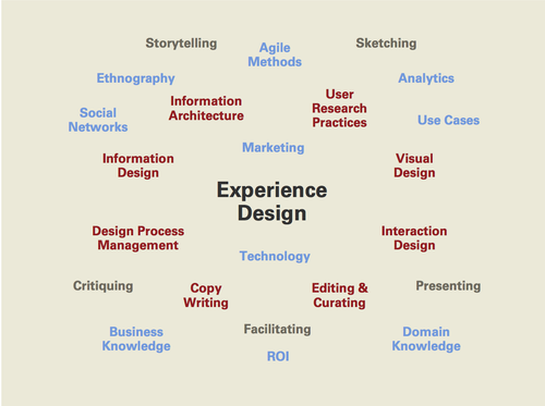
This is quite a list, but it’s attainable. Here are Jared’s tips for becoming a design unicorn:
- Train yourself
- Pick something you’ve never done and learn everything you can about it.
- Practice your new skills
- Deconstruct as many designs as you can
- Ask yourself: “how could I make that better?” or “how would I do that?”
- Seek out feedback (and listen to it)
- Teach others
In an effort to cultivate more Design Unicorns, Spool has started the Unicorn Institute (which has the best URL ever) to improve UX education and become a resource for students and teachers in this field. I encourage you all to sign up and get involved with the project in whatever capacity you can.
Ideas to think about
There were way more nuggets of wisdom than I can possibly fit into this post, so allow me to give you some bite-sized highlights:
- JEFFREY ZELDMAN: Use Remote Preview to test a URL on a number of mobile devices simultaneously.
- KAREN MCGRANE: “It’s not a strategy if you can’t maintain it.”
- KAREN MCGRANE: Don’t truncate your headlines on mobile devices! There’s a comical Tumblr that pokes fun at bad truncation on The Guardian.
- LUKE WROBLEWSKI: Did you know you can include media queries inside an SVG file?! This makes it possible to have one SVG file for a logo or icon that adapts to different sizes automatically.
- TIM BROWN: Molten Leading allows for fluid line height on the web (typography alert!).
- TIM BROWN: Type Rendering Mix is a tool that swaps out fonts based on the user’s platform. For example, Mac users would be served the “Light” style and Windows users get the “Regular” style, creating better visual consistency across different text rasterizers.
- ETHAN MARCOTTE: M-Maji is a project to help people find clean water in Africa on their mobile phones.
- JEREMY KEITH: If you’re designing a password input field, consider making the password visible by default and include a checkbox to toggle the “secure” asterisked view to improve usability and reduce input error.
- JEREMY KEITH knows how to play the mandolin (quite well).
- JEREMY KEITH: designing a good URL structure is a great exercise when building a website; your URLs should be readable/guessable/hackable.
- JEREMY KEITH: Don’t rely on 3rd-party APIs because you never know when they’ll evaporate.
- JEREMY KEITH: “The best way to be future-friendly is to be backwards compatible.”
- CHRIS COYIER: Autoprefixer lets you configure the browsers you want to support and it will automatically output the correct CSS for each (for things like Webkit elements).
- CHRIS COYIER: CodeKit and LiveReload will compile your .scss files easily.
- LEA VEROU: Her slides are freely available online right here (and she showed off some truly amazing CSS tricks)
- MIKE MONTEIRO: You should really read Design for the Real World by Victor Papanek.
Phew! This is really only a slice of the whole conference (which I would wholeheartedly recommend), but hopefully it gets some gears turning in your heads. I’ll reiterate one of my favorite quotes from the conference from Mike Monteiro (just before he dropped the mic and walked off-stage):