It is with great pleasure that we can finally announce the relaunch of the Chapter Three website! A year in the making, this site represents a culmination of efforts encompassing our evolution as a brand, company, and collection of talented web professionals.
Defining our company values
We began by asking ourselves what we stood for as a company. Having grown from a scrappy start up, we were ready to rethink who we were and who we wanted to become. We created our company values to serve as the foundation for our culture, business decisions and brand identity. These values clarify who we work with, what we invest in, and what drives us.
Expanding our brand qualities
Next, we identified the characteristics that we wanted to cultivate. We wound up with a strong list and started to think about how we could strengthen those characteristics. Our expression of them happens across all mediums. For instance, cultivating being a thought leader is only possible if we empower our team to blog, speak at conferences, and share what we know.
Logo redesign

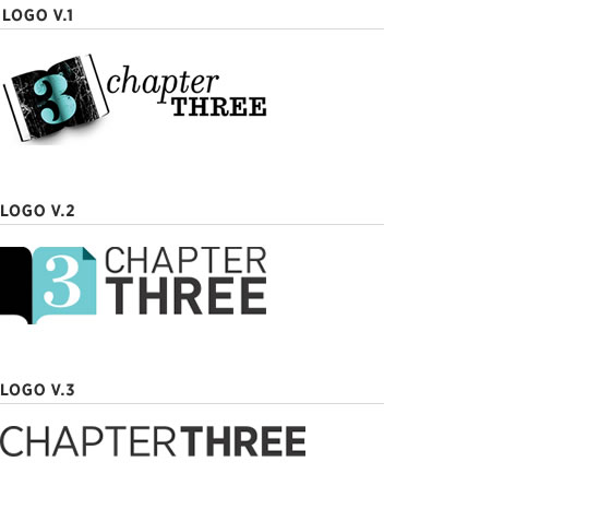
We didn't throw out our old logo, but instead designed a minimalist lockup with a new typeface. Our goal was increased simplicity with a modernized aesthetic. We updated our old logo with our new typeface to use when that lock up is desired.
Photography

Aspirational, San Francisco photography served as the primary concept for imagery on the site. Dramatic Bay Area landscapes produced a more visually impactful site, evoking an emotional response at first glance.
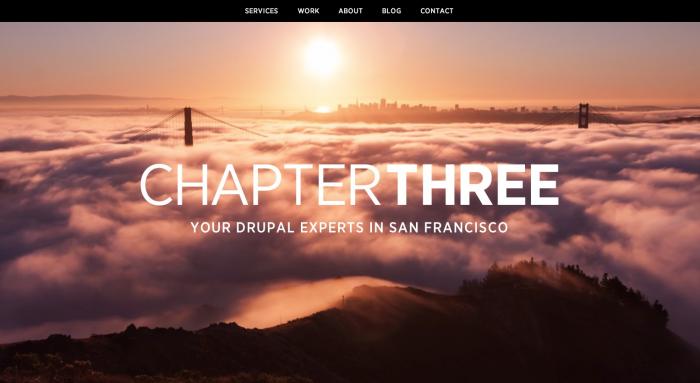
As a San Francisco company, we needed to convey our geolocation in an original manner. We found a remarkable local artist, Simon Christen, who created a series of stunning time lapse videos showcasing the dramatic ways that fog tumbles across Bay Area landscapes. We commissioned Simon to generate a video loop for our home page and sourced similar imagery throughout the site.
Typography
We decided to adopt Gotham Narrow, a modernist typeface that is beautiful and clean, yet also warm and approachable. We felt that it struck a balance between professional and friendly, while maintaining good readability.
Home Page

We took a bit of a risk with our home page by eliminating all content other than the key video, logo and tagline. The goal was to create something simple and memorable with emotional impact. We will revisit the effectiveness of this over time; our plan was to start simple and elaborate if necessary.
UX
Simplicity was our guiding design principle in the redesign. Content was cut, edited, and combined to deliver a more focused experience. To achieve this, we:
- Combined "Clients" and "Case Studies" into one tab called "Work"
- Eliminated e-commerce for our trainings, replacing it with Eventbrite
- Simplified the sidebar content on our blog
- Collapsed presentation and video content into a blog post format
Writing
A website's copy is often the most neglected piece; we bucked this trend by taking our copy seriously. We rewrote all of the services and case study content, giving proper consideration to target audiences and collaborating with team members with writing backgrounds who understood the Drupal industry.
Collaboration

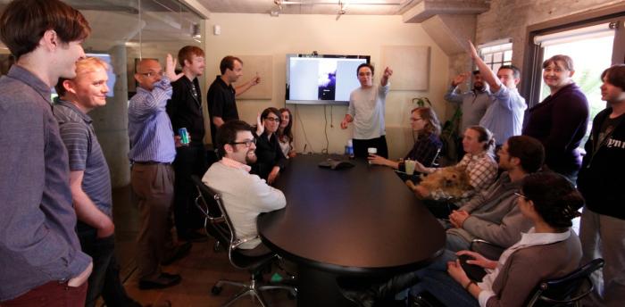
This is the first project that our entire design team did together. Learning to collaborate, give feedback and steer the design took practice. With three slightly different design aesthetics, we had to find solutions we all agreed upon, which took time. We challenged one another and, in the end, produced a site that made us all proud.
Developer/Designer/PM collaboration remained critical as we moved into implementation. We used this project as an opportunity to improve our colllaboration practices and to find better ways to help one other.
Development Highlights
Lean Site Building & Minimalist Drupal
Our goal was to build something lean and lightweight so we used Views and Display Suite exclusively for layouts. Our experience has taught us that minimalist sites are easier to maintain and function better in the long term. We used less than half of the modules you would find on a typical site.
Custom Responsive Grid Systems
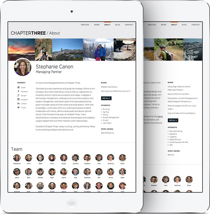
For the list view of employees on the About page, we used the Isotope module and some complex math to display the images evenly, even when sorted by the taxonomy filters.
Looping Imagery in Responsive Layouts

The design team created an interesting challenge for the developers with the profile page. We needed a way to display a variable number of header images that repeat when displayed on a large screen. To increase speed, we implemented a front-end Javascript solution rather than back-end PHP.
Home page magic
One intersting challenge was to create consistnecy across all break points for the lock up of our Chapter Three logo and tagline, since one was a .png and the other was live text. The solution inolved dynamically scaling the text using Javascript based on the width of the page. The full scale video implementation was created using BigVideo.js.
Case Studies
To achieve design integrity, and for ultimate control over content display, we opted for a static HTML/CSS case study implementation. We did this knowing we would create new case studies infrequently, and that new ones would be unique. This differed from past solutions where we leveraged stuctured content, but found them too rigid to effectively showacse our work.
Thanks and Props!
Thank you so much to Garret, Darius, Rocks, Matt, Susan, Rob, Theo, Steph, John and the whole Chapter Three team for helping this project come together. It could not have happened without you!