The future is now
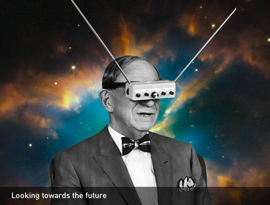
At the Design4Drupal camp in Boston there was a lot of talk about responsive design the state of design and where the future of design is headed. There was much discussion about what types of devices we may soon be designing for and how people will interact with them.

People may use the internet on their fridge, on Google Glass, or even on an alarm clock or inside their car. Almost any electronic device can be readily transformed into an internet capable tool.
Society is quickly moving into the Jetsons era and the future is now. This means that some of the original design patterns that we leveraged to introduce people to new technologies are also changing. As users get more sophisticated, design systems evolve into something that is more suitable to the medium, rather than emulating models from the past.
Visual Metaphors
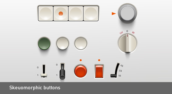
In the keynote lead by Kevin Oleary and Jesse Beach, they discussed an interesting design pattern that uses visual metaphors to familiarize people with new interfaces and devices. The technique is referred to as skeuomorphism. A skeuomorph is a physical ornament or design made to resemble another material or technique. In other words, that means making buttons on your cell phone resemble analog buttons from the physical world.

As people become more familiar with technology, the need for prompting them with visual metaphors diminishes. A new visual language starts to emerge, one that is born from the digital world. Books no longer have to have paper-like layouts with simulated page flips and garish drop shadows. Buttons don’t have to jump off the screen or look like switches or knobs. We can begin to construct new design patterns that are more appropriate for the digital world that we are building.
Design of the times
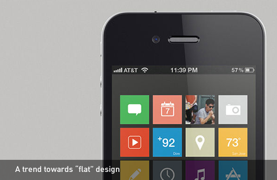
The flat design trend that is all the rage lately may be an indication that people are ready to abandon their skeuomorphic training wheels. Windows 8, iOS 7 and even the Android OS have dropped 3-dimensional metaphors in favor of sleek, minimal design elements. Does this mean that glossy, candy coated buttons are officially a thing of the past? Are kitschy faux wood textures and simulated paper gone for good? We can’t be for certain, but trends tend to be cyclical. What’s here today will likely be different tomorrow.

Design is also more than purely utilitarian. Just because we don’t need to lure users with candy coated buttons anymore doesn’t mean that we still can’t use them in our designs. It’s all about creating a unique look and feel that is appropriate for the design at hand.
Do you think that flat design is the language of the future, or just another trend? What other future-forward design patterns have you noticed lately?