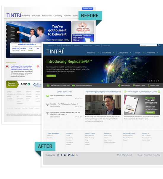
To expand and gain a stronger foothold in the VM storage market, Tintri turned to Chapter Three to create a new look and feel for their business. As a team, the two companies built a stronger content structure that spoke more effectively to Tintri’s primary audiences.
The project was a resounding success, resulting in an immediate 30% increase in traffic and a significant uptick in lead generation after just one month.

Chapter Three took us from concept to completion on time and on budget—even though we didn’t have a lot of either. Their process kept the project moving along and still met our iteration expectations. From a site maintenance standpoint, we can now do in a few minutes what used to take hours. We’re ecstatic with our new site and so are our visitors. When I hear from people that have been on the site, their first comment is usually around how easy it is to find what they’re looking for. Great work all around.
- Dave Frederick | Senior Director of Corporate Marketing
Identifying the problem, developing the solution
Tintri, a B2B specializing in VM-aware storage, wanted a new website to better solicit business from larger companies. Their existing Wordpress site looked dated, and it was not instilling confidence in larger customers. It also failed to provide enough flexibility for their communication needs.
We solved Tintri’s problems with a two-pronged approach:
- Improve the visual presentation of the site
- Restructure the site to serve up more relevant content
Improving the visual design

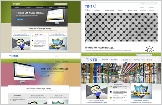
Tintri wanted its website to convey simplicity and efficiency without unnecessary frills or adornments. The company wanted straightforward and consistent communication. Our team approached the design aesthetic from a variety of perspectives until we found the right fit.
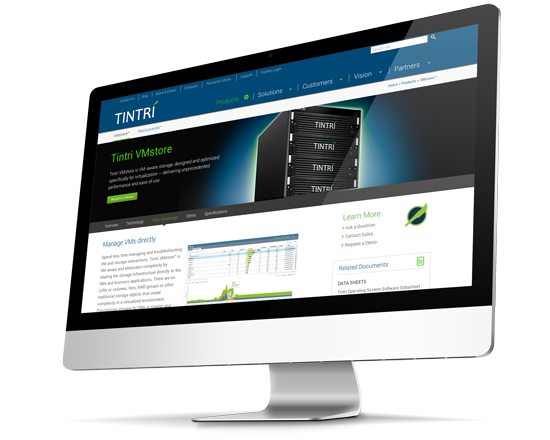
As a rapidly-growing startup, Tintrí needed to have a design that could scale along with the business and support a visionary approach. By creating a full-width design, we could reinforce these company attributes with maximum real estate for strong visual messaging.

Leveraging Drupal’s strengths for content strategy
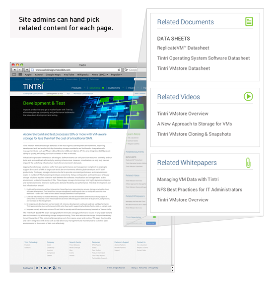
Tintri’s technical audience prefers consistency and brevity over jargon and fluff. Understanding that site visitors were coming primarily for information, we built ways to showcase nine different kinds of related content on almost every page. With this approach, visitors can find what they are looking for without hunting around or use the search function. It also allows site administrators to create content once, and leverage it multiple times.
